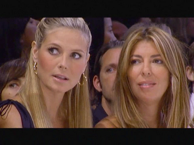
Truth be told, we were kind of dreading this all week. Whether you agree with our takes or not, we've been trying to offer as balanced a view of each collection as possible, pointing out what works and what doesn't in each. Michael, beloved and talented as he is, put together a collection that makes it very difficult to say anything positive. When that collection walked down the runway, you could feel the crowd in the tent struggling with it in silence.
The judges did their damnedest to keep it off their faces:
But if you're not in the front row, why bother?
Vincent, for once we're in complete agreement.
If his goal was "high impact," mission accomplished. If nothing else, it was a striking collection and the styling choices were typically well-chosen, as were the models. Michael has an eye for striking and unconventional- looking women.
The music...well, it was certainly young and in your face, but it was clear that the models couldn't walk to it.
Let's start the show.
This actually wasn't bad. The styling is great, the proportions work, and if it had been the only look with the lacing and gold belt, it would have been fine. Unfortunately, he returned to those themes one time too many.
Again, not bad. Striking model, great shoes and jewelry, good proportions. A somewhat unambitious look for a runway show, though.
And this is the point in the collection when everyone asked "Is it an all-white collection?" We question the wisdom of...well, first off, having so much white in his collection at all, let alone having his first four looks be all white with gold accents.
Thank god he listened to Tim and edited out the bling in this outfit, but the gold belt looks cheap and leaves her floundering in hookerland.
We don't understand this outfit. Michael is usually so good with fit and proportion and her whole midriff looks off. The waist is too high on the pants and it's strangely loose where it should be more fitted. It's clear that Michael wanted to tell the story of a sexy woman and well, this outfit isn't all that sexy. And the gold sequins just make it look (again) cheap.
Maybe "rowr kinda woman" means "cheap." We don't get the kids and their hip lingo.
Color! Finally!
Alright, we admit it. You were right, Alison and Tim. She is a plus-sized model. Nothing wrong with that, although why he would put her in an outfit that makes her look even wider eludes us. This is Myrna's Miami Mah-Jong-by-the-pool outfit. Unflattering and mature-looking when it was obvious that "mature" was not what he was going for.
This look, we actually liked. Yes, it's putting it all out there, but there's nothing wrong with that if it's done well. The fabric is beautiful as is the styling. Could have done without the beading at the neck, though; an element he returned to in several of the looks. If you have a beautiful print, why cover it with beading? What does it add?
And that model was bringing the sass. We thought maybe she was going to slap one of the photographers at the end of the runway just for the hell of it.
Part Zwei coming soon!
[Photos: FirstView]
Post a Comment


No comments:
Post a Comment