WARNING! WARNING! We are heading into a bra-free zone! Please keep your hands inside the car and refrain from jumping up and down!
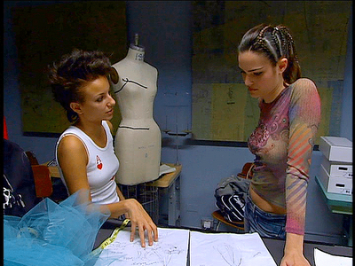
Poor thing. She tried to give her client what she wanted and what her client wanted was the fashion equivalent of one of those 99-cent greeting cards covered in glitter.
It's strange. Last week she was all about trying to assert her POV in a situation where she wasn't supposed to and this week she just folded without ever really trying to make the design her own.
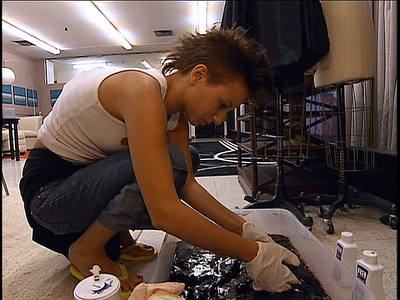
Especially since she had a perfect opportunity when those damn roses came out of the dye looking so horrible. She could have just said to Melissa "I tried the roses but they didn't work."
Seriously, they look like cabbages.
We don't know if the previous week's drama tripped her up or what, but this doesn't even look particularly well-made.
Nothing says romance and new beginnings like a bunch of dead shriveled flowers. She looks like she walked through a graveyard on the way to her wedding.
And that corseting looks awful.
Definitely not well-made. That bodice is all kinds of puckery and ill-fittery.
Ah well. Like we said, a shame. Nora has talent and a stronger aesthetic than some of the remaining designers but it really all does come down to maturity and experience. If she'd had a little more she could have asserted herself in the design and been able to think on her feet and make quick changes without angering her client.
[Screencaps: projectrungay.blogspot.com]
Post a Comment


No comments:
Post a Comment