skip to main |
skip to left sidebar
skip to right sidebar
Ripping the Collections: Jeffrey, Part Eins
 Out of the final four, it was Jeffrey whose collection made the strongest statement. The show itself was somewhat anti-show. The music, while beautiful and haunting, came off at times as downbeat and morose and the models couldn't walk to it at all. The styling was a little bleh and the shoes were downright ugly.What it lacked in showmanship, however, it more than made up for in risk-taking and cohesion.Let's start the show.God, those shoes. They wound us. Probably not half as much as they wounded her, though.
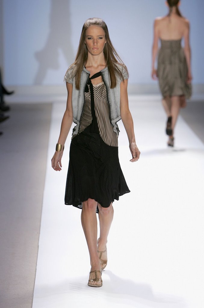
Anyway, we'll start off by saying this fabric was plain ugly. In fact, Jeffrey almost always makes fabric choices we hate. We're not a big fan of all the extraneous strappy/hangy stuff, but the proportions work and the dress as a whole makes an impact, if an understated one.
Really, really hate the proportions here. That looks more like a foundation garment than a bathing suit. It is a bathing suit, right?
The jacket and bag are nice, though.
Lorenzo loved it, Tom hated it. Lorenzo thinks it looks young, pretty and delicate. Tom thinks she looks like Strawberry Shortcake.
We have to say, this really grew on us. Yeah, it's a little gimmicky and we question who would wear it, but there's something about the color and proportion, the careful sloppiness and planned asymmetry of the straps. It just works. Great pants too.
This one did not grow on us. We liked it on the rack when he showed it to Tim, but it got seriously ugly on a model. For once, we love the fabric, but we hate long-in-the-front hems. It always makes her look like she's wearing an apron. The dress looks deceptively simple but if you blow up the pic, he constructed the hell out of that thing. Too much so, in our opinion.
Love the jacket. The little capped sleeves and the open-zippered back look new and different. The skirt is great too, but this whole "tied together" thing has to go. He had the beginnings of a perfectly good design but that "uni-suspender" is distracting as hell. And pointless, to boot.
[Photos: FirstView]
Post a Comment


No comments:
Post a Comment